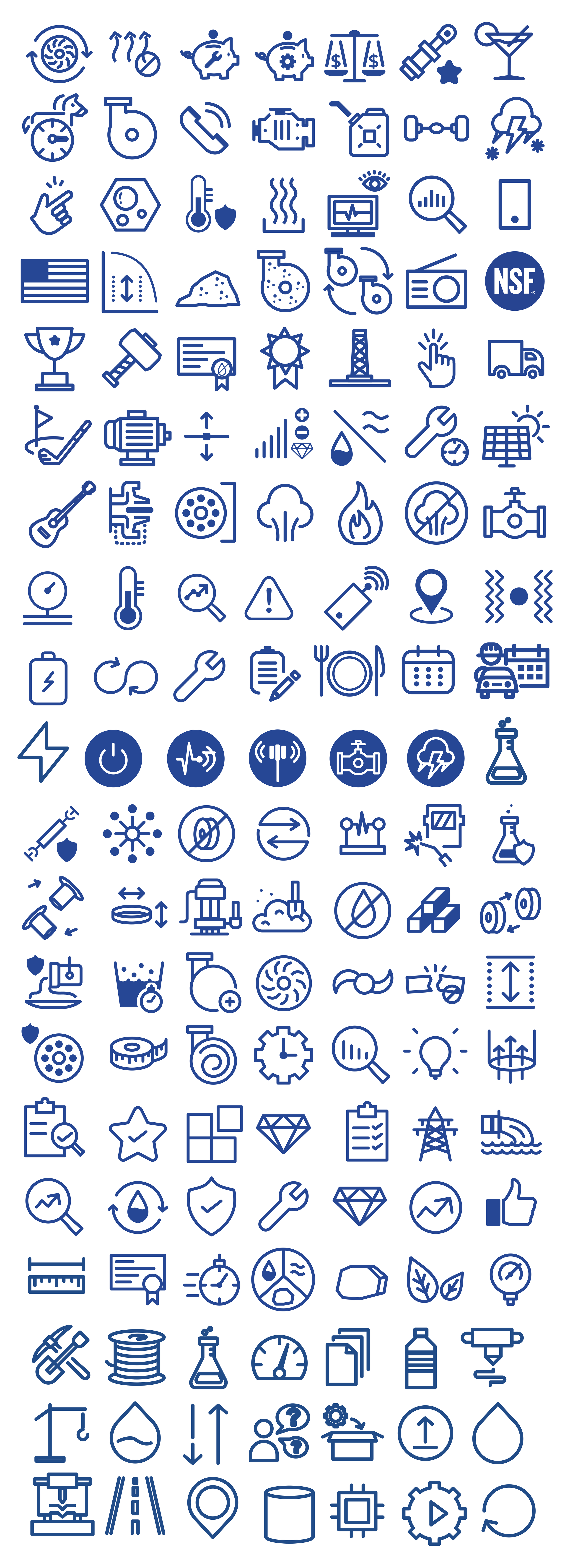
Corporate Iconography
Throughout my work as a designer, I made a point of creating all iconography in-house rather than relying on purchased or stock assets. What began as individual icons for specific projects eventually grew into a custom library of more than 75 unique illustrations, creating a visual language that could be used consistently across print, digital, environmental, and marketing materials.
The subject matter was incredibly diverse—from mechanical components and industrial equipment to IoT monitoring, manufacturing processes, metal press stamping, food and beverages, and industry-specific applications. Each icon presented a different challenge: distilling sometimes highly technical or specialized concepts into simple, recognizable graphics while maintaining a consistent visual style.
Building this library allowed me to combine illustration, information design, and brand development into a flexible visual system that could grow alongside the organization. Because every asset was created specifically for the brand, even the smallest graphic elements felt cohesive and distinctly its own.
The result was a library of 75+ completely custom icons—no stock graphics, no purchased assets, all designed from the ground up.
And yes, if you’re wondering what 75+ custom icons look like inside Adobe Illustrator, the answer is a truly unreasonable number of artboards. My Illustrator file may never forgive me.